I was asked by a journalist last week for statistics on trends in life expectancy of Australian men, and in particular, where Australia ranked in the world. So I pulled out our latest life expectancy estimates, published a couple of months ago, and took a look. I also looked at the same rankings from the UN life tables published in World Population Prospects 2012 (released in June 2013). The UN publishes life tables for 5-year periods, such as 2010-2015 (centred on2013), whereas we estimate annual life tables for individual years. The latest year we have released is 2012, but I took our one year projections for 2013 and ranked male life expectancy at birth and age 60 for years 1993 and 2013 to examine changes across two decades.
For life expectancy at birth, Australian men had maintained the same 5th rank in the world across the two decades, with life expectancy in 1993 of 75.2 years and in 2013 of 80.4. The leading countries in 1993 were Iceland, Japan and Sweden whereas by 2013 they had become Switzerland, Iceland and Singapore. Of course, the differences in life expectancy between these countries, measured in a few tenths of a year, are probably within the real uncertainty of these estimates, and not too much can be made of the individual ranking comparisons. For countries where it is older age mortality that is largely determining trends in life expectancy, issues around accuracy of age attribution in death certificates and in population estimates, and the various methods used to construct the final open-ended interval in the life table, mean that there is actually some uncertainty in estimates even for countries with good death registration and census data, and the estimates of difference UN agencies and academic groups may differ in the details.
The more important point to make is that the life expectancy at birth of Australian men has increased at just over 2.5 years per decade over the last two decades, or more dramatically, that is equivalent to a gain of just over 6 hours per day. This is almost identical to the frontier life expectancy trend identified by Oeppen and Vaupel (Science 2002), who plotted the highest observed life expectancy at national level over more than 200 years. The frontier trend is contributed by different countries over time, but it is essentially linear with a 2.5 years per decade slope.
What is happening to life expectancy at older ages for Australian men? After all, that is where the action is now. Australia has gone from 9th rank in 1993 (19.7 years) to first rank in 2013 (23.7), just ahead of Switzerland, Israel and Japan. Not that the differences between these three countries are statistically significant. I guess I can be inspired by the fact that I am an Australian (longest life expectancy in the world at age 60) and living in Switzlerland, currently longest life expectancy at birth in the world.
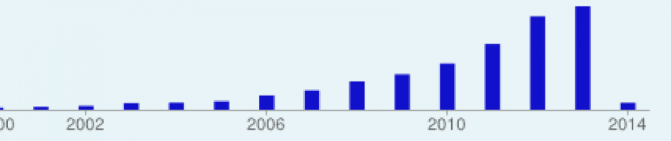
These dramatic trends for Australia reflect substantial reductions in mortality rates for ages above 60, predominantly for heart disease and stroke, that started around mid-1970s (see graph below) and reflect reductions in smoking and improvements in blood pressure and cholesterol control as well as increasing effectiveness of early treatment for heart attacks and stroke. Of course all these statistics are calculated using cross-sectional mortality rates for each age group observed or projected for the year 2013, and the likely average life expectancies of age cohorts alive today will likely be longer because of continuing declines in mortality rates into the future. Perhaps when I have a moment, I’ll do some comparisons of countries using projected cohort rather than period life expectancies.
